The Strategy
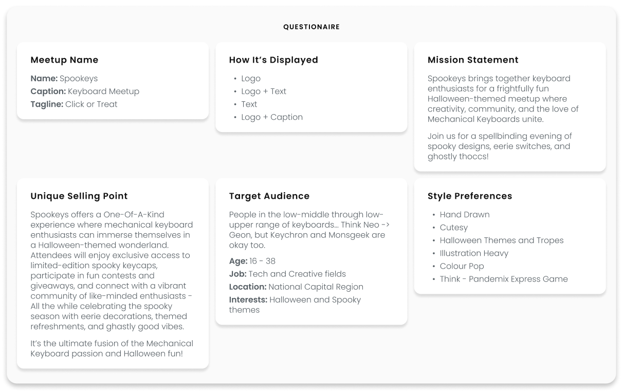
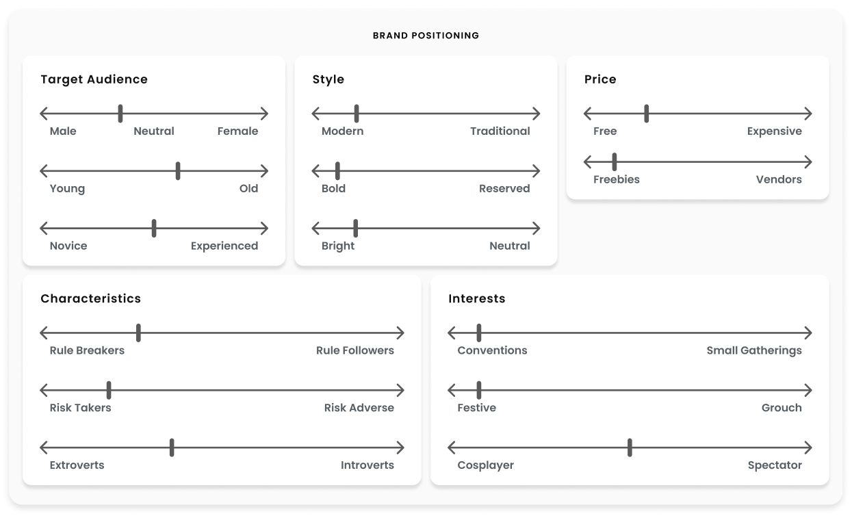
The foundation of Spookeys was a strong, cohesive brand. I began by defining a Unique Selling Point, crafting a Mission Statement, and developing detailed Target Audience Personas. Using mood boards, brand positioning exercises, and word associations, I established a solid direction for the event’s identity.
The very first step, like in many great projects began with a question:
What the h*ck is Spookeys?
To answer that, I went to the client and began asking questions. Who are they? What's their Unique Selling Point? What exactly are they looking at have me do? Who are their target demographic? What do they want it to look and feel like? How do they want their brand to be positioned in the market?
This was all done with a single purpose of getting to know Spookeys, so I can build their brand to best fit their needs.
Once I got an understanding of who they are, the next important question was:
Who the fr*ck are their clients!
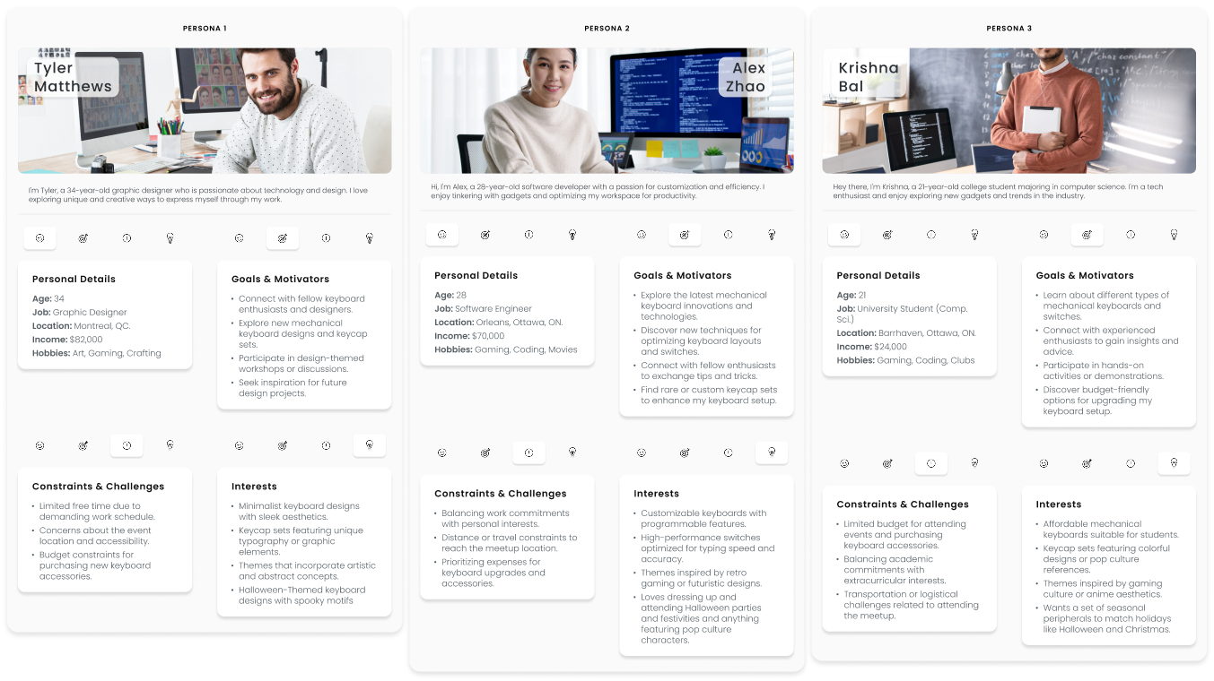
So, I started to delve into creating some personas for their target audience. Allow me to introduce Tyler, Alex, and Krishna. Each of whom has their own stories, interests, and tastes. This step was easily the most made-it-or-break-it moment in this whole project. From this point on, every decision, every pixel, and every thought was with the soul purpose of attracting those very people.
Alrighty then! Now that we know what Spookeys is, and who their clients are...
It's about time we start designing, shall we?
In order to get a understanding of how we'll be designing, I started with developing a set of moodboards. From doing some market research, and comparing it to the wants and needs of our personas, I was lead down two directions:
-
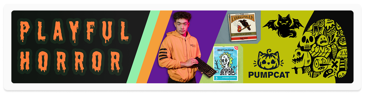
Playful Horror
This mood board showcases a more whimsical take on horror—think The Nightmare Before Christmas or Coraline. It embraces exaggerated, cartoony elements with bold, eye-catching colors like neon greens, purples, and oranges. The designs feature playful typography, quirky character illustrations, and an overall lighthearted spookiness.
-
True Gore
This mood board took inspiration from classic horror films and vintage horror posters, embracing a grittier, darker aesthetic. Deep reds, blacks, and desaturated tones dominate the palette, evoking a sense of dread and suspense. The imagery leaned into eerie textures, distressed typography, and a more raw, hand-drawn lithographic style, reminiscent of underground horror zines. This approach added an edge to the branding, making it feel authentically chilling.
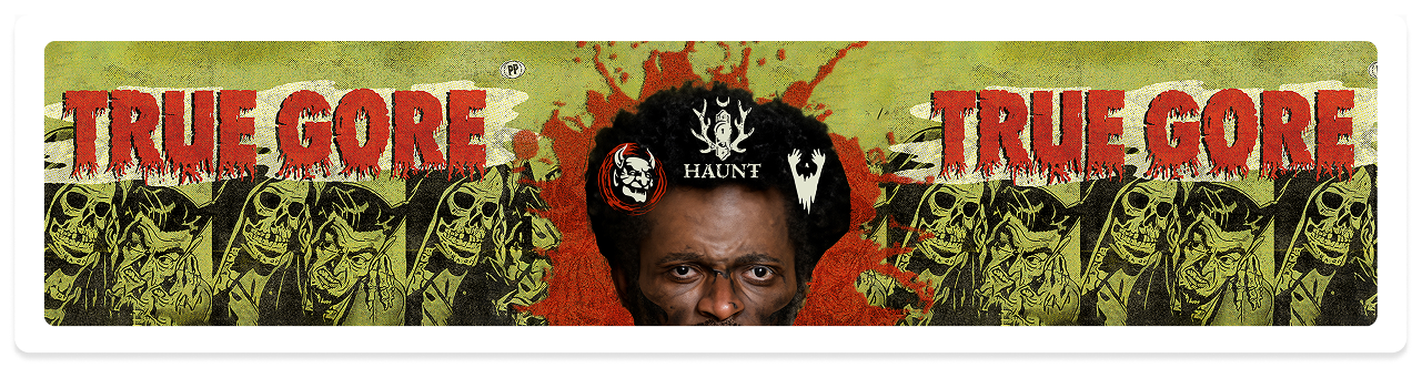
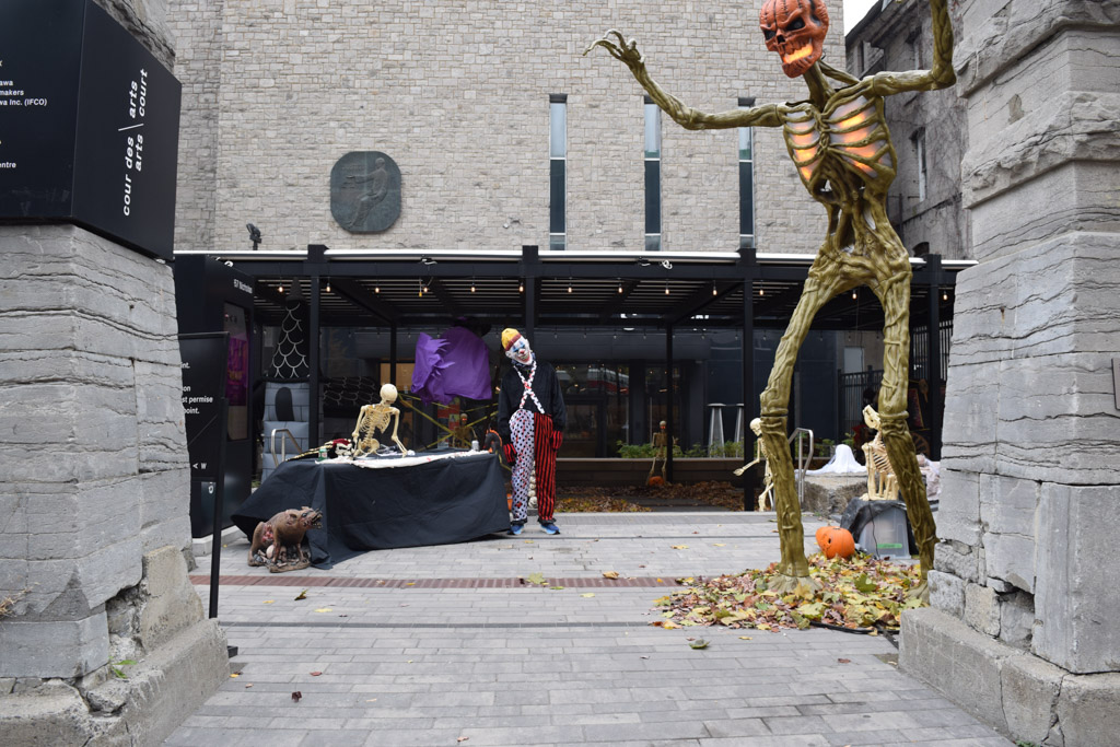
In the end, a decision was made to go down the route of true gore, while adding a few playful elements where applicable to keep it light and approachable to their target audience.
With all the prep work set in place, how 'bout we hit the ground running, shall we?
Besides, all we have left are the pretty parts!
First things' first... The logo! I began by exploring multiple rounds of sketches... hundreds and hundreds of sketches. After every round, I would take a set back, consult our beloved personas, and revised as necessary.
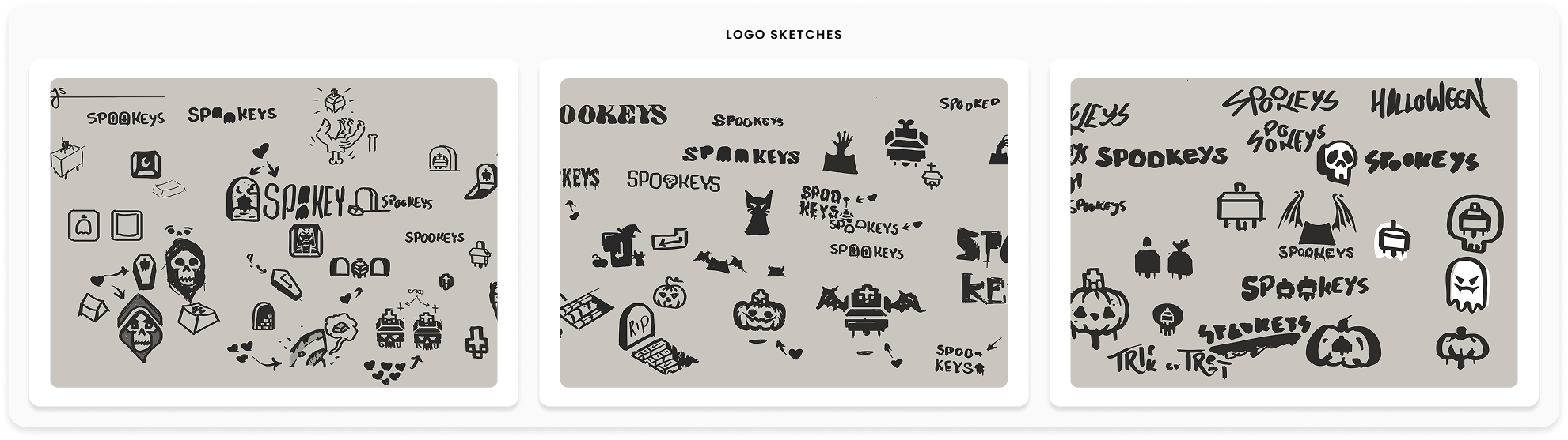
After 5 rounds of skecthing different logo concepts, we have our finalists!
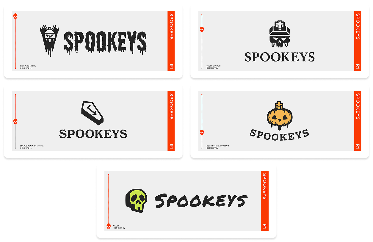
And our winner is
Digital Presence & Marketing
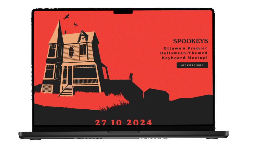
Now that the branding is all locked and loaded, I begand the design and development a dedicated event website! From drafting an initial concept on paper, to producing a high-fidelity prototype on Figma, and eventually to full implementation through HTML, CSS, and JavaScript (All hand coded).
With the website up and running, all that was left to do was to hit the market!
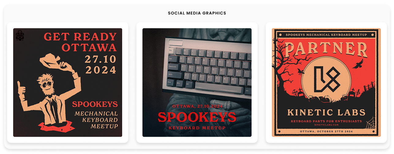
Next up on our to-do list is to market Spookeys! From Instafram and Tiktok campaigns where I produced engagement-focused posts, countdowns, and teaser videos, to setting up the EventBrite page so that they could start picking up ticket sales. Heck, I even got featured on the radio!!!
Speaking of radio segment, why not give it a listen?
Supplementary Assets
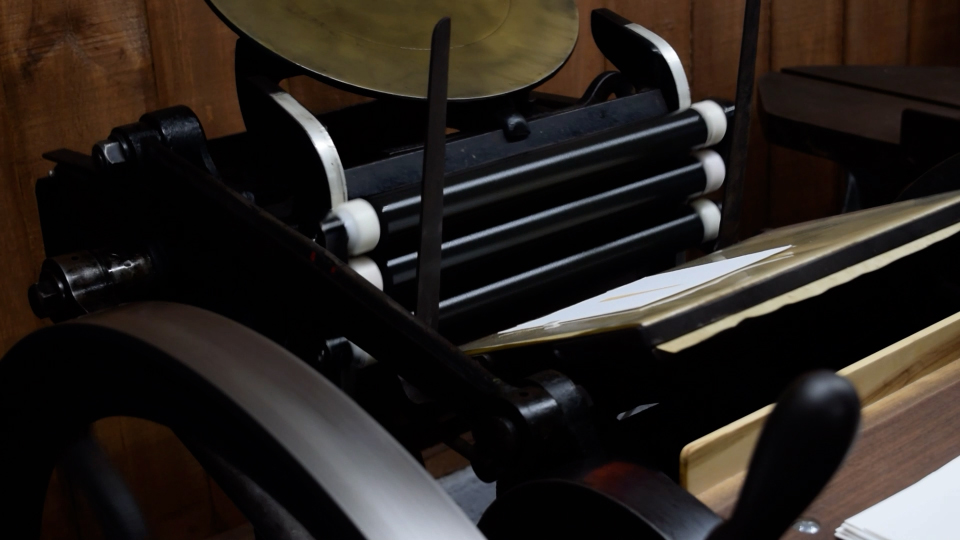
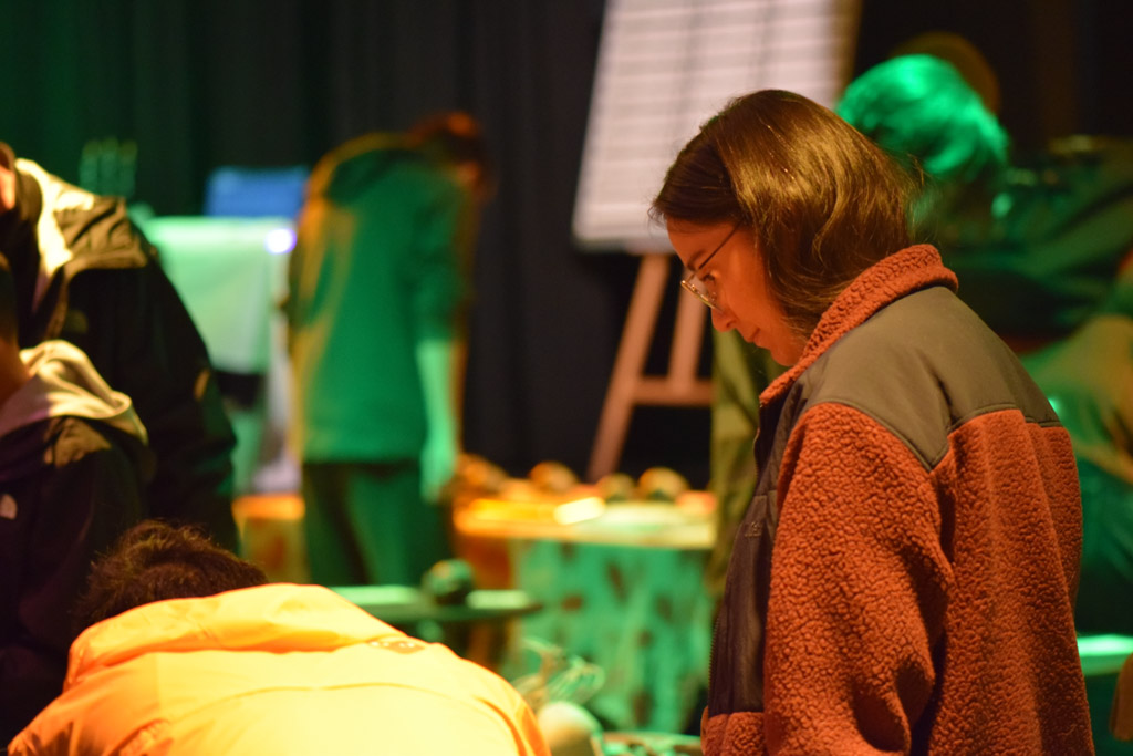
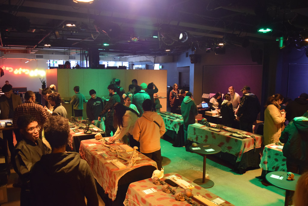
As we approached the home stretch, the list of to-dos neared completion, all that was left was the fun stuff like logistics and contract signing. But in all honesty, it was at this point we got to focus on some of the more unique projects, like designing swag and placemats, planning for decorations and brand attendance, and eating lots and lots of Halloween chocolate. This granted me an opportunity to pull out my 1890's Letterpress to print some luxury swag!
The Results
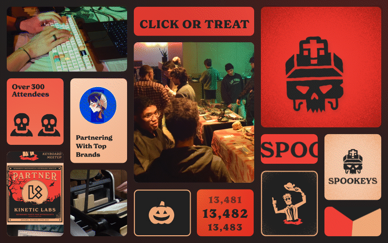
Spookeys was a resounding success, with attendees already asking about next year’s event. The brand’s cohesive identity, combined with strategic marketing and flawless execution, made it a standout experience in Ottawa’s event scene.
Too Long, Don't Care:
This project showcases my ability to develop an event brand from scratch, execute a full-scale marketing campaign, and create a seamless attendee experience. If you’re looking for a designer who can take a concept and turn it into a fully realized, immersive brand, let’s talk.